— I thought they favored gradation over resolution. What were the catalogues actually selling?
“Large-Format Lenses Favor Gradation” — That Is What I Thought
Somewhere in me there is still an image of large-format lenses as lenses built with gradation in mind, not resolution alone. Where I heard it, or whether I read it somewhere, I cannot remember. I probably picked it up from something I heard or read.
Let me say this first. When I went back to the makers' material from the period for this article, I did not find, anywhere in it, the general story that “large-format lenses gave up resolution in favor of gradation.” That is not proof that nobody was saying so at the time. This article is not written to declare my memory wrong. It asks why I came to feel that way, and what the makers themselves were aiming for.
One more thing up front. When I bought lenses for 4×5, the first thing I looked at was not the resolving-power figures. First the image circle. Then whether the color rendering suited my taste. Then compactness. Resolving-power and contrast figures I glanced at, no more; I assumed a first-rank maker would be good enough, and that the final impression could not be known without shooting.
My first 4×5 was a complete system, bought in one go with a bonus. A standard 150 mm came with the set, and I added a 65 mm wide-angle. About a year and a half later I bought a 150 mm from a different maker. I remember the Japanese catalogue of the time describing that lens as “the ultimate lens.” How it would actually draw, I did not know until I had bought it.
Let me read that catalogue again. This is not, however, an article that lines up the history of large-format lenses or a list of catalogues. The question is a single one. Does the image I carry — “gradation over resolution” — match what the makers said in their own words? And if it does not, what were the makers selling, and what was I looking at?
Let Me Give the Answer Here
Within the primary sources I read for this article — the large-format lens catalogues of Fuji, Nikon, Schneider and Rodenstock — the general claim that “large-format lenses gave up resolution in favor of gradation” could not be confirmed. That is not proof that no such idea existed anywhere at the time. But what the makers were selling, in their own words, was resolution, contrast, the area the lens covers (the image circle), color, flare, illumination fall-off and distortion — as separate items, all at once.
One more point. The f/16 and f/22 written in the catalogues are conditions for “the area covered at that aperture.” They are not declarations of “the aperture at which the center is sharpest.” I will come back to this.
And then there is my own side of the story. What I looked at when choosing a lens was the image circle and the color rendering. One reason, I now suspect, may have been the margin of resolution that a large original had over the print. That is not something the sources show; it is my guess. This article keeps three things apart: what the sources show, what can be calculated, and what I was looking at.
In the previous article, on why Velvia was used as a “high-quality” film, I mentioned briefly that I had put the difference in blue skies down to the lenses. This article continues from there. The cause of those blue skies, though, is not something this article tests either.
What the Catalogues Were Selling — All at Once
The large-format lens catalogues of the period, from every maker, sold a number of qualities side by side.
Nikon's large-format catalogue (the one I consulted for this article is an English-language edition from the early 2000s) lists high resolution and image contrast and negligible flare for the wide-angles, aberration correction, high contrast and faithful color for the standard lenses, and, for the telephotos, chromatic-aberration correction by ED glass and sharpness free from flare and ghosts — each in its own words. In the description of the long-focus lenses, “faithful reproduction of subtle variations in color and shading” and “high resolution and contrast” sit side by side in the same product text (quoted from the English-language catalogue). It is not written as a choice between resolution and gradation.
Rodenstock's later English-language catalogue says of its higher-grade standard lens that its strengths show “when complex, fine structures in the outer part of the image circle have to be reproduced,” and sells the wider field angle as permitting “even more generous shifts” (quoted from the English-language catalogue). What is being sold here is not resolution at the center but rendering in the outer field — the part you use with camera movements — and the room to move.
Schneider's material, too, puts sharpness and contrast alongside separate items: the edge of the field, illumination, distortion, and the margin for movements. Fuji's large-format lens catalogue sells higher performance to bring out the performance of the film, and it is not written in any way that reads as pulling back on resolution.
What we have to be careful about here is that this is the makers' sales talk. That the catalogues say “faithful color” and “no flare” is a fact; it does not mean those lenses measured better than another maker's. What can be said is this: the makers of the time were selling neither resolution alone, nor gradation at the expense of resolution. Resolution, contrast, coverage, color, flare, illumination. Several axes were already lined up at the point of sale.
f/22 Was Not “the Sharpest Aperture”
Large-format lens catalogues give the diameter of the image circle as “so many millimetres at f/22” or “at f/16.” That f/16 or f/22 is a condition for coverage: “stopped down this far, this much area is usable.” It does not mean “this lens is sharpest at f/22.”
This is an easy thing to misread. I have heard the phrase “large format is shot at f/22” myself, and after seeing f/22 lined up in the exposure data of photobooks shot on 4×5, people have asked me, “For mountain photography it's always f/22, isn't it?” But the reason f/22 gets chosen is not a peak in resolution at the center. Securing the coverage; depth of field; a margin for the focus plane when movements are used. Those are the reasons the lens was stopped down.
In fact, Rodenstock writes of its higher-grade standard lens that, because it performs well out to the edge of the field, it “can be used with a wider aperture than other large format lenses in order to avoid blur due to diffraction, e.g. with f-stop 16 as its working aperture instead of f-stop 22” (quoted from the later English-language catalogue). The maker itself does not call f/22 the best aperture. The general story of performance at wider apertures and diffraction I have written up in the article on f/8 and the one on stopping down two or three stops, so I will not repeat it here.
I myself normally shot 4×5 at f/22. When I was worried about the focus shift after movements — what I used to call “aori-boke” — or about depth of field, I stopped down to f/32 or f/45. Focusing, composing and setting the movements are done with the lens wide open; stopped down, the ground glass is far too dark to check anything.
To be honest, back then I had absorbed the idea that “a bellows camera is strong against diffraction,” and I hardly questioned it. Shooting systematic comparisons at different apertures was something I never did, given the cost of film and processing. That was a belief I held at the time, not a fact about bellows cameras. Diffraction is a matter of the lens aperture.
The Image Circle Is Not “What Fits” but “Room to Move”
The reason for using a bellows camera is the movements. Rise, fall, tilt, swing. I used them every day. “If you're not going to use movements, you don't need a bellows camera. There are more than enough medium-format cameras that are far easier to carry.” That was how I thought at the time.
Using movements means shifting the position of the film inside the circle in which the lens forms its image — the image circle. So the image circle is read not as “does it cover the film” but as “how far can I move.” The image-circle tables in the catalogues state, for each format, how many millimetres you can move up and down and side to side, and that is where I looked when choosing a lens. For me the image circle was a specification you looked at as a matter of course — the way you look at the maximum aperture today.
So my way of choosing began with the image circle. Coverage for 5×7, and if possible usable up to 8×10, was what I wanted. That was not an absolute condition, though; if a lens's drawing appealed to me, I would accept a compromise on coverage.
Some lenses left almost no room. The ultra-wide 35 mm and 45 mm I used barely covered the 6×12 format, and unless the lens axis and the film back were lined up dead square, the corners were cut off. Looking at a later English-language catalogue, that 35 mm is recommended up to 6×9 and the 45 mm up to 6×12, and on 6×12 the room to move is slight. Here my memory and what the sources say agree. With the 90 mm and the 65 mm the bellows got in the way, so I bought a bag bellows. Even then the margin was tight.
This is not to say that a lens with a larger image circle is, by that alone, a better lens. Coverage and the quality of the drawing are separate things. Rendering in the outer field, the part used with movements, was one axis of performance — the makers went out of their way to sell it. But what happens to the focus plane after you move the lens — the “aori-boke” question — is a matter of the camera and of focusing, not of the lens. I will leave it to the next article.
For the Same Print Size, a Smaller Original Needs More Enlargement
Let me step away from lenses for a moment and talk about the size of the original.
To make a print of the same size, the smaller the original, the more it has to be enlarged. That is obvious, and it is one of the margins large format has.
In my own terms at the time: “With film this much bigger, the resolution comes almost an order of magnitude for free.” That was how it felt when I moved from 35 mm to 4×5.
Of course, that is a feeling, not a figure. For this article I set the conditions and worked backwards. Take a print at the 600 × 900 mm size — what Fujifilm's current print service calls zenbai — made with the whole original kept in the frame. A 35 mm original (24 × 36 mm) is enlarged about 25 times, a 6×9 (56 × 82 mm) about 11 times, a 6×12 (56 × 112 mm) about 8 times, and a 4×5 (an image area of roughly 96 × 120 mm) about 6 times. To hold the same fineness on the print, the fineness required of the original scales with the enlargement. So, working backwards under the condition of enlarging to the same 600 × 900 mm print, the fineness required of the original differs by about four times between 35 mm and 4×5.
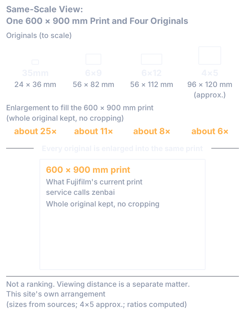
Fig. 1: The same 600 × 900 mm print (what Fujifilm's current print service calls zenbai) made from 35mm, 6×9, 6×12 and 4×5 originals. With the whole original kept in the frame, the enlargement is about 25, 11, 8 and 6 times. Not a ranking — it shows only that the same print needs a different enlargement from each original. Viewing distance is a separate matter. This site's own arrangement.
Not an order of magnitude. Measured as fineness of line, about four times. The detailed conditions behind the numbers are in the second half of this article.
What can be said from this, and what cannot. What can be said is the geometry: a larger original has a lower fineness requirement for the same print. What cannot be said is any absolute pass or fail for a lens or a film — “so 4×5 only needs so many lines per millimetre,” or “35 mm needs a lens with so many times the resolving power.” I have no period measurements for large-format lenses in the material at hand. The enlargement story in the earlier article ran in the direction of grain becoming less visible; the fineness required of the lens going down is the same geometry, seen from the other side.
And did that margin make it easier for my eyes to turn to the image circle and to color? I think it may have. But that is my guess. It is not a story about the makers designing things that way, and it is not that I was thinking, at the time, “there is margin here, so let me look at something else.”
What I Saw in the Lenses: Between Line Art and Color
From here on this is not the sources; it is how things looked to me.
The 65 mm wide-angle I added to my first 4×5 was a Nikon. My first impression was: “Incredibly sharp — so this is how overwhelming the amount of information is on medium format!” Next to it, the standard 150 mm that came with the set looked like “well, it takes a picture, I suppose.”
About a year and a half later I bought the Rodenstock 150 mm. I bought it on the strength of the catalogue's words, so I did not know how it drew until I had it. I shot with it, and the color rendering surprised me. My first strong memory is of mountain greens and blue sky. Probably a 6×9 transparency, and the film, I think, was Velvia.
After that I replaced the Nikon 65 mm with a Rodenstock 65 mm. I did shoot a comparison under the same conditions, for form's sake. But I already felt the difference was obvious in everyday shooting, so the test was closer to a confirmation. From then on the Nikon 65 mm went unused.
In my words at the time, the Nikon 65 mm was “all-in on resolution.” “It felt almost as if it rendered only the edges — almost like line art.” The Rodenstock was “all-in on gradation.” “Like full-color animation, or CG.” “It heightens the feeling of seeing with your own eyes.” And yet it is not natural. The naked eye does not see that much detail.
Put another way: the detail is all there, enormously so. But it does not show that detail as lines; the colors and tones between the lines stay in the picture as well. That is how it looked to me.
This is how I saw it, not a fact about how the lenses were designed. I compared two lenses under the same conditions only once, one pair, and it does not add up to a general statement that “Nikon is line art” and “Rodenstock is gradation.” In fact, the Nikon telephoto lenses I used later — a set whose rear group is swapped to give 360, 500 and 720 mm — I chose partly because telephoto design is known to be difficult and partly because I expected resolving power from Nikon; and in use they gave no unpleasant impression of “aggressively high resolution,” and I had no complaint about their gradation. So even within my own experience, “Nikon equals resolution and nothing else” does not hold.
I also used Fuji's lenses: a 250 mm and, I think, a 300 mm and something in the 400 mm range. I remember the 250 mm as a comparatively large lens. Among the longer focal lengths there were some that were slow but light, with a very large image circle. I cannot pin down the exact models or focal lengths now. Their color rendering was quite close to the Rodenstocks, and I privately filed them as “a more affordable Rodenstock.” Focal lengths missing from the Rodenstock lineup I filled with Fuji. That, too, was my own shorthand, not an objective assessment.
Why the color looked different from lens to lens is not something this article tests either. As far as this article goes: that is how it looked to me.
Most People Around Me Used Nikon: The Shiki Group
In the mountain-photography group I belonged to, Shiki, most people used Nikon's large-format lenses. Someone who has used Nikon on 35 mm and moves up to large format naturally chooses the maker they know. And at the time, I think, not many people were strongly aware of differences in rendering from one maker to another. There was no internet, and photobooks and mooks go through printing, so subtle differences between lenses are hard to judge from them. To see a difference, the quickest way — and it costs nothing — is to put the transparencies from the lab on a light table and look through a loupe. You can compare them with other people's transparencies right there, under the same conditions. Not that I was systematically analyzing brand differences from other people's transparencies.
Let me continue, a little, the story of the friend I told in the previous article. “Why is the blue sky in your photographs always so good? There must be times when the conditions are bad.” “If there's a difference,” I answered, “the only thing it could be is the lenses.” That friend later replaced his lenses with Rodenstock.
Some time afterwards, on a joint shoot with the group, I noticed that a lot of people were using Rodenstock. “Huh.” “So they've finally noticed.” And, if I'm honest, a little annoyed: maybe I should have kept it to myself.
This is a story from inside one group. It says nothing about which maker sold more in the market, and it is not a story of my having spread anything. Whether it passed from my friend to the other members, I do not know.
“Does Not Even Flinch” at 600 × 900 mm — and What I Saw at 1 × 2 m
Back to the margin of the original.
A 4×5 original, at a print around the 600 × 900 mm size, does not even flinch — that is my sense of it. It is a feeling from experience, not something based on measured values for the lens or the film.
On the other hand, I have also had the experience of seeing the limit begin to show. For an exhibition I once had a 6×12 transparency optically printed to about 1 × 2 m. Not something to be seen only from a distance, like a giant advertisement; visitors walk right up to it. In that print the edges had begun to soften a little, and I think the grain could be seen. My memory is that color and saturation were also a little down. At the time I thought: it's an optical print, that's just how it is.
I cannot write this up as “the limit of the resolving power of the lens for 6×12.” Enlarging to 1 × 2 m means enlarging a 6×12 original about 18 times, and not only the lens but the film, the enlarging lens, the paper, the processing, and where the viewer stands all enter into the result. What can be said is only that, enlarged that far, some link in the chain began to show.
Years later I heard from someone who made prints for a living that raising the camera's resolution does not simply come out in the print. Even with margin on the original's side, there are gates on the print's side that a photograph has to pass through. That story I will leave to another article.
How I Saw It and What the Lenses Were Designed For Are Different Layers
What I looked at when choosing a lens was the image circle, the color rendering, and compactness. The resolving-power figures I glanced at, assuming a first-rank maker would be good enough. The memory that “large-format lenses favor gradation over resolution” is still with me. Where I heard it or read it, I cannot remember.
What the material I could check for this article says is this. The makers were not pulling back on resolution to sell gradation; they were trying to make resolution, contrast, coverage, color and flare control hold together at the same time. f/22 was the aperture that secured the coverage, not a declaration of the sharpest aperture.
What could be calculated is geometry. A larger original has a lower fineness requirement for the same print. For a 600 × 900 mm print, about four times between 35 mm and 4×5.
What is still not known, I leave as it is. Whether that margin is the reason my eyes turned to the image circle and to color is only my guess. Why the color looked different from lens to lens I have not tested. And where the story “gradation over resolution” came from, back then, I do not know.
Large-format lenses gave up resolution and chose gradation — at least in the makers' material I checked for this article, no such simple story emerges. What the makers' material shows is lenses meant to make several qualities hold together at once. And I, for my part, was looking hard at the image circle and the color rendering within those lenses. Those two things belong to different layers.
And did buying a good lens mean the best image quality? After the lens, there is still focus, the flatness of the film, and stray light. Those I wrote about in the next article, “Was Large-Format Image Quality Just About the Lens?”.
For Those Who Want to Go a Little Deeper
The conclusions this article needs are complete above. What follows is supporting detail on the points I passed over quickly, and a closer look at what is not known, for readers who want it. There are no new claims.
What the Catalogues Said: Four Makers
The material read for this article was Fuji Photo Film's large-format lens catalogue (a Japanese edition from around 1995, the one mentioned in the previous article), Nikon's large-format lens catalogue (an English-language edition from the early 2000s), and English-language catalogues from Schneider and Rodenstock (later editions, some of uncertain date). These are not the very editions I was using in the 1990s. Whether the wording was the same in the editions of the time has not been confirmed.
What the four makers have in common is that they list resolution or sharpness, contrast, aberration correction, coverage and the margin for movements, color, flare and coating, distortion and illumination as separate items. That Nikon's description of its long-focus lenses puts “faithful reproduction of subtle variations in color and shading” next to “high resolution and contrast” is a counterexample to the either/or of “resolution or gradation.” All of this, though, is the makers' wording, not a superiority confirmed by measurement.
How to Read an Image-Circle Table
As one example, Rodenstock's later English-language catalogue tabulates its higher-grade 150 mm standard lens as working aperture f/11–22, field angle 75°, image-circle diameter 231 mm, with 72 mm of rise/fall and 55 mm of shift on 6×12, and 51 mm and 45 mm on 4×5. The ultra-wide 35 mm has a 120° field and a 125 mm circle; the 45 mm, 110° and 131 mm. Their recommended formats are up to 6×9 and up to 6×12 respectively. Nikon's 65 mm is listed as a 170 mm circle at f/16 (for 4×5).
Two cautions in reading these. First, the diameter is the value at the stated aperture and is not necessarily the same as the area that is actually usable. Second, each maker sets its conditions differently, so these numbers cannot be used to rank one maker against another.
f/16, f/22 and Diffraction
The f/16 and f/22 in the image-circle tables are conditions for the coverage at that aperture. Rodenstock writes of its higher-grade standard lens that, because it performs well to the edge of the field, f/16 can serve as the working aperture instead of f/22, avoiding blur due to diffraction. Schneider cautions that in close-up work at 1:1 an f/22 setting becomes an effective f/45, and sharpness falls off through diffraction, so one should not stop down more than necessary. The general story of aperture and diffraction is in the article on f/8 and the one on stopping down two or three stops.
Working Backwards from the Same Print Size
These are the conditions behind the numbers in the main text. For print sizes I used the names and dimensions of Fujifilm's current print service: hansetsu 356 × 432 mm, zenshi 457 × 560 mm, dai-zenshi 508 × 610 mm, and zenbai 600 × 900 mm. Whether the same names meant the same dimensions in the 1990s I have not confirmed from period sources. For the originals I used 24 × 36 mm for 35 mm, the image areas of Horseman roll-film holders for 6×9 and 6×12 (56 × 82 mm and 56 × 112 mm), and, since 4×5 varies with the holder, roughly 96 × 120 mm.
The enlargement is calculated with the whole original fitted inside the print's outline (no cropping). For the 600 × 900 mm size: 35 mm about 25 times, 6×9 about 10.7, 6×12 about 8.0, 4×5 about 6.2. Since the fineness the original needs in order to hold the same fineness on the print scales with the enlargement, the ratio 35 mm : 6×9 : 6×12 : 4×5 comes to about 4.0 : 1.7 : 1.3 : 1. For the print sizes closer to 3:2 — 356 × 432 through 508 × 610 mm — the difference between 6×12 and 4×5 is only about ten percent; the gain of 6×12 shows on elongated prints.
Where you set “the same fineness” on the print depends on viewing distance: stricter up close, more relaxed from further away. This article does not fix that criterion at a single number. And since there are no period measurements for the lens side, I make no judgment of “enough” or “not enough.”
Nikon's Telephotos and Fuji's Lenses: The Sources' Side
Nikon's early-2000s catalogue describes ED-glass telephoto lenses at 360 mm f/8, 500 mm f/11 and 720 mm f/16 whose rear group is swapped from one focal length to the next, of a telephoto type that does not need a long bellows extension. That matches my memory. For Fuji's lenses, Horseman's lens-compatibility list records models such as 250 mm f/6.3, 300 mm f/8.5 and 450 mm f/12.5 with their image-circle values, but that is a camera maker's compatibility table, not Fuji's design material, and which models the ones I used were has not been established.
Aperture Shape and Ghosting
Into the light, once the sun is inside the frame you cannot shade the lens, and you get ghosts. In my memory the aperture of the small shutter (a Copal No. 0) had five blades, the ghost came out as a large pentagon, and I rejected those frames on sight. The No. 1 had seven blades, and its ghosts were still bearable. Stopping down to f/64 or f/90 made the pentagonal ghost itself physically smaller, and in practice that worked best. The blade counts here are what I could confirm from secondary sources, and they may differ with the period of manufacture. Flare arising inside the lens and stray light arising on the bellows or camera side are separate matters; the latter I leave to the next article.
What Is Not Known
Here, together, are the things this article has treated as not known. Period sources for the names and dimensions of print sizes in the 1990s. The exact image area of a 4×5 holder. The exact wording and date of the Rodenstock Japanese catalogue I read. The exact models of the Fuji lenses and the Nikon 65 mm I used. Period measurements for individual large-format lens models. Why the color looked different from lens to lens. When, and from where, the story that “large-format lenses favor gradation over resolution” came.
The Scope of This Article
The sources in this article are the wording of the makers' catalogues, not measurements. My experience is that of one person, in one group, in mountain photography, in Japan. The design goals the sources show cannot be restated in terms of my experience, and how things looked to me cannot be refuted by the sources. Both are left as they are, each as a matter of its own layer.