From the yellow-green of new leaves to deep green — what was I seeing in between?
New Leaves: Between Yellow-Green and Deep Green
When I photographed new leaves in spring, what I was looking at was not “green.”
Leaves that have just opened are yellow-green. Leaves that have opened a little further are green; leaves in the sun are deep green; and last year’s leaves are darker still. A single tree holds all of those colors.
But what I cared about in the photograph was not how many colors there were. It was whether the passage from yellow-green to green, and from green to deep green, was there — whether one color connected to the next without skipping anything in between. The way we put it at the time was: “Does the gradation connect smoothly?”
Fresh Snow: Between Light and Shade
The other thing I looked at closely was fresh snow.
When light falls on newly fallen snow, there are parts that glare and parts that fall into shadow, and between them lies a surface of snow that darkens a little at a time. From the glare to the shadow, does that subtle change continue without losing what lies in between? Here, too, I was looking at what I called gradation.
You could say that in new leaves I was watching a change of color, and in fresh snow a change of brightness, and that would be close. But that is only how I saw it; both are mixed together in each.
What I Was Calling “Rich Gradation”
Looking at photographs like these, I felt they had rich gradation.
The Japanese photographic term I was using — kaichō, usually translated as “gradation” or “tonality” — is the word this article is about. One thing I want to add: rich gradation, as I meant it, did not mean strong contrast between light and dark. A photograph that was too crisp and punchy was, to me, a failure. When the difference between yellow-green and deep green is exaggerated and the leaves split into separate planes of color, what lies between them disappears. But if the difference vanishes altogether, that is wrong too. The differences are still visible — but so is everything in between. That is the state I was looking for.
In the case of new leaves especially, this was, to my eye, more a matter of saturation than of brightness: whether the slight differences in vividness within the same green stayed connected without breaking.
Where I felt this kind of gradation most strongly was in a transparency placed on a light table. I will come back to that.
Let Me Give the Answer Here
So what was “rich gradation”? Was it dynamic range? Was it bit depth?
Neither.
“Gradation” was not the name of a single physical quantity. In the technical literature on film there was a measurable core: the curve that shows how the image changes with exposure, and the slope of that curve. At the same time, when a photographer said a picture had rich gradation, the word could be standing in for several properties of the photograph as it was finally seen — on the transparency, on the print, on the printed page. My new leaves and fresh snow are exactly that.
So if you replace the old word “gradation” with today’s “dynamic range,” or with “bit depth,” it does not fit. To think about it in the language of 2026, you have to split it into several elements. I will get to that split below.
In the previous article, I wrote about why the question “how many megapixels is 4×5 film?” has no single-number answer. This article is its sequel. Can the single word “gradation” be replaced by a single number?
In the Technical Literature, “Gradation” Could Be Measured
Let me start from the documents of the time.
A film has a curve that describes how the density of the image changes as you change the exposure. It is called the characteristic curve. A 1998 Fujifilm technical report describes, for one film, how the slope of that curve was designed region by region, from the highlights to the shadows — softening the gradation from the midtones to the highlights, for instance, to improve the rendering of skin. For the people designing film, “gradation” was something measurable: the slope of a curve.
At the same time, the literature treats gradation as an item separate from the others. Another 1998 technical report lists “image tone reproduction” — the tonal rendering needed for a print to look right — and the recordable range as separate items, and a 1987 paper on copying technology lists “naturalness of light and dark” under tone reproduction and “clarity of detail” under resolving power, with granularity as a separate item again. Gradation was a category of its own, distinct from resolving power and from granularity.
The word also appears in product language. For a film released in 1983, Fujifilm’s company history cites “rich reproduction of gradation” (translated from the Japanese), and the 1990 Velvia catalogue lists “color rendering with depth” and “excellent shadow rendering,” separately from granularity and resolving power. These are not definitions. They are a record of how the manufacturer sold the film.
How widely photographers of the time used the word in this sense, however, is something I could not establish within the scope of this research. What is known is this much: the people who designed film had a way of measuring it; the literature kept gradation separate from the other image-quality items; and “rich gradation” was already being used about products of the 1980s.
Splitting One Word into Six
So how can we think about the “rich gradation” photographers were seeing, in today’s language? For the purposes of this article, I split the single word into the following six elements. This is this article’s framework, not a definition from the period.
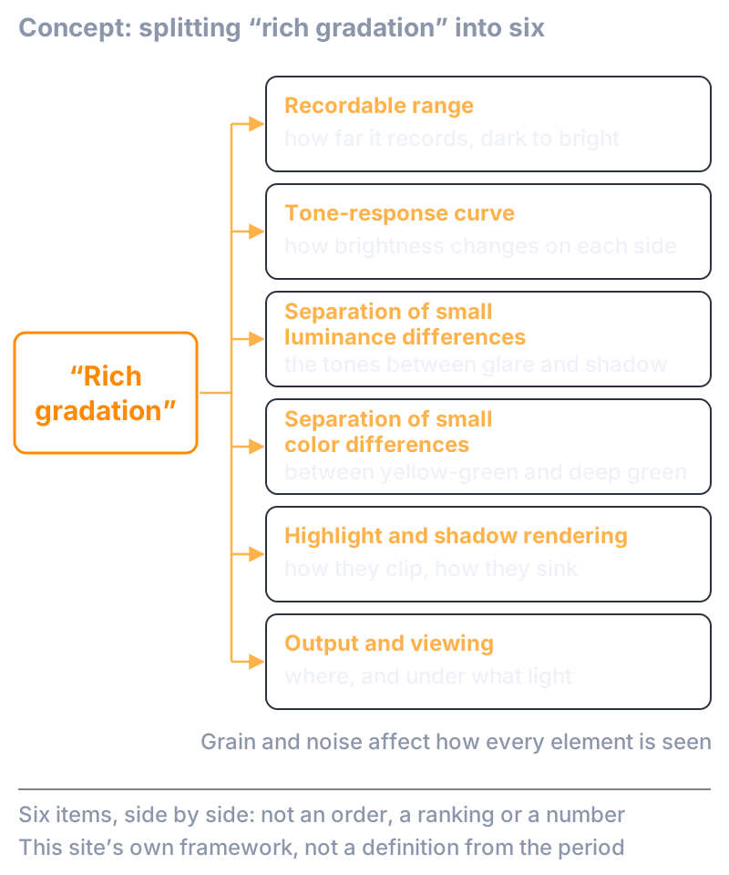
Fig. 1: Splitting the single word “gradation” into six elements. No element ranks above another, and this is not a definition from the period. It is this article’s framework.
The first is the recordable range: how far the film records, from the darkest part to the brightest. In today’s terms, dynamic range is the nearest word. But it is a range, not the way things are rendered within that range. The second is the tone-response curve: within the same range, the change is distributed differently on the dark side and the bright side. The “slope of the characteristic curve” in the literature belongs here.
The third is the separation of small luminance differences — the tones between the glare and the shadow of fresh snow. The fourth is the separation of small color differences — the tones between yellow-green and deep green in new leaves. The fifth is highlight and shadow rendering: how the brightest and darkest parts clip, and how they sink.
The sixth is output and viewing. The same transparency looks different on a light table, as a print, on a printed page, on a screen — and under different light — and all five of the elements above change with it.
Grain and noise are not one of the six so much as something that affects how each of them is seen. Even if a small difference is there, it will not be visible if grain or noise covers it. Dynamic range is the first element; bit depth, as I will explain later, is about the fineness of the steps. Neither is gradation itself. Each is one element of it.
You do not need to memorize all six. It is enough to see that several different questions were bundled into the single word “gradation.”
Negative and Transparency Are Not the Same Story
When we say “film” as one thing, there is something easy to overlook. With negative film and with reversal (transparency) film, the object whose gradation you look at is different.
A negative becomes a photograph only when it is printed on paper. The slope of a negative’s curve is made deliberately gentle, and the paper compensates for it, so that the final print has its gradation. Negative and paper are one system.
Reversal film is a photograph as it comes out of development. You look at it on a light table, project it, or send it to prepress. Its curve also runs the other way from a negative’s: the more exposure, the closer to clear. So the behavior described for negatives — “the bright parts shoulder off and hold on” — cannot simply be applied to a transparency. Overexpose a transparency, and that part goes clear.
You still hear the phrase “film holds its highlights.” It is probably a mixture of three things: the shoulder of negative film, adjustments made at the print stage, and the contrast with digital clipping. The experience I write about in this article is about transparencies.
The Original Transparency, the Print, and the Photo Book
Now, back to the story I set aside.
Where I felt gradation most strongly was in the original transparency — the developed film itself, before any print or reproduction — on a light table. When it was made into a direct print, a print made directly from the transparency, it looked to me as if it had dropped several levels. The gradation looked stepped, as if the in-between tones had dropped out. In the printed page of a photo book or a magazine, still more of the in-between seemed to be missing.
This is how it looked to me. I am not saying, on the strength of a measurement, that the transparency is above and the printed page below.
There was a saying at the time: “Don’t ever look at a photo book and think your own photographs are better.” “Better” here meant, to a large extent, gradation. The photograph in a book is not the original; you must not take the result of printing for the quality of the original and compare yourself against it. That, as I understood it, was a working rule of the trade.
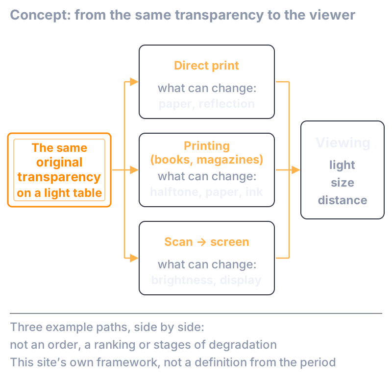
Fig. 2: The same transparency can look different in gradation depending on the path — print, printed page, screen — and on where it is viewed. The figure does not show an order, or stages of degradation.
This has the same structure as “the number depends on where you measure it” in the previous article. Beyond the original there is the paper of the print, the halftone dots and ink of the printed page, the brightness of the screen, and finally the light, the size and the distance at which it is viewed. What I was calling rich gradation was not decided inside the film alone; it was also the result seen at the end of this path. Fujifilm, in a 2015 retrospective article, describes how an original that looks fine under a loupe can look flat when greatly enlarged — which connects to “from where, and at what size, you look” in the circle-of-confusion article.
Going Digital: The First Pictures That Looked Like Prints
The first digital camera I used was not the Nikon D1. Before that, I used a Fujifilm compact digital camera, a FinePix.
To my eye, the FinePix’s pictures looked like a full-color print in the printmaking sense — a picture, not a photograph. Flat, two-dimensional. There was no sense of depth at all.
With the D1, for the first time, I remember thinking, “This finally looks like a photograph.” Compared with the FinePix, the sense of depth was of a completely different order.
Let me note a point that is easy to misread. The difference was not sharpness. The D1 was soft — quite soft, in fact — rather than crisp. Even so, what differed between the FinePix and the D1 was not sharpness but depth, and the softness was a minor thing next to that difference.
So why did the FinePix look like a print and the D1 like a photograph? The sensor? The fineness of the recording? The image processing? Something else? From my experience alone, I cannot say. I leave the cause open, and record only this: sharpness and depth were not, for me, the same axis.
If We Say “Gradation” Today
If you use the phrase “rich gradation” in 2026, it is better not to compare with the word left in one piece. That is this article’s conclusion.
With digital, the number that comes up alongside gradation is bit depth. Eight bits gives you 256 values; fourteen bits gives you 16,384. The important thing is that these are the number of available steps on the scale. It does not mean that the eye can see 256, or 16,384, distinct tones. However fine the steps, they are invisible if noise fills them; and how many steps you can see changes with the curve used to map them to brightness, with what you display on, and with the light you view under. “Fourteen bits, so rich gradation” is too simple.
The same goes for dynamic range: it is the recordable range. A wide range is one thing; whether the in-between of brightness and color looks good within that range is another.
So if we talk about gradation today, I would rather decide first which of the six elements we are talking about. Then it stops being a contest between film and digital. You take each element, set the conditions, and look.
Beyond Gradation: Depth and a Sense of Air
Finally, let me write down one question that this article does not answer.
Among the transparencies where I felt the gradation was rich, I cannot think of one that had rich gradation but no sense of depth. What differed between the FinePix and the D1 was also depth. And recently I met this feeling again, with a Panasonic GH6. With the equipment I had used before, I sometimes felt a certain flatness, a two-dimensional quality. With the GH6, above and beyond depth, there was something I want to call a “sense of air” — not mood or atmosphere, but the feeling that there is real space between the trees.
It was in Kamikochi, photographing the trees on the far bank of the Azusa River. Looking at the image, I felt the trees standing in front of and behind one another almost as if I were seeing them with my own eyes. More than front and back, it was the feeling that the air was really there.
Gradation, depth, a sense of air. In my experience these three came one after another. But I do not think they are the same thing, and I cannot say in this article that rich gradation produces depth, or that depth produces a sense of air. Are the three really connected, technically? That is for another article.
In the end, when I looked at new leaves and felt the gradation was rich, what I was seeing was not the two colors, yellow-green and deep green, but what lay in between. And what lay in between was not the width of the recordable range, nor the number of steps on a scale; it was how the connection looked, including where and how it was viewed. It does not become a single number. How that in-between relates to depth and to a sense of air, I do not yet know.
For Those Who Want to Go a Little Deeper
Everything this article needs in order to conclude is above. What follows is for readers who want a closer look at the points I passed over in plain words. There are no new claims.
The Characteristic Curve: Toe, Straight Line, Shoulder
A film’s characteristic curve plots density on the vertical axis against the logarithm of exposure on the horizontal axis. On negative film, density rises as exposure increases, and the curve is described in three parts: the toe, where the rise is gentle at low exposure; the straight-line portion in the middle; and the shoulder, where the rise flattens at high exposure. Kodak’s sensitometry workbook puts it as the shadows of the subject “falling” on the toe, and the highlights on the shoulder. The shape of the curve depends not only on exposure but on the developer, the time, the temperature, the agitation and, for color film, on each color layer.
Slope: Gamma, Contrast Index, Average Gradient
There are several ways to measure the slope of the curve. The slope of the straight-line portion is called gamma; the slope between two defined points is called Contrast Index or Average Gradient. The steeper the slope, the more a difference in exposure comes out as a difference in density. The 1998 Fujifilm technical report mentioned above describes, for one film, dividing the curve from highlights to shadows into regions and designing the gamma of each, softening the gradation from the midtones to the highlights to improve the tone reproduction of skin. “Gradation design” meant this design of the slope, region by region. But the design philosophy of one product cannot be turned into a definition of film in general.
Exposure Latitude
Exposure latitude, in the definition of the Kodak workbook, is the permissible change in camera exposure that can be made without a significant effect on image quality. Place the brightness range of the subject somewhere along the full length of the characteristic curve, and what is left over is how far the exposure may be off. This is about the margin for error at the moment of shooting. It is not the recordable range itself, nor the smoothness of gradation.
Negative and Paper Work as One System
According to the same workbook, the slope of a negative film’s curve is made well below 1.0 — typically around 0.45 to 0.65 — in order to widen the exposure latitude. To compensate for that low slope, printing paper has a slope greater than 1.0, from about 1.5 to 3.5 depending on the grade. The gradation of a negative appears not in the negative alone but as the result of this combination. The curve of reversal film is like a mirror image of the negative curve: high density at low exposure, approaching clear at high exposure. Color reversal film has no orange mask, and the curves of its three color layers lie almost on top of one another.
Dynamic Range
Dynamic range is the range between a chosen saturation criterion and a chosen noise criterion, and the number changes with the criteria you choose. The dynamic range of the standard that deals with noise in digital cameras (ISO 15739) is a rather narrowly defined quantity that depends on saturation and on a signal-to-noise criterion. Because the definition differs from film’s exposure latitude, the two numbers cannot be set side by side — and neither of them is the historical definition of “gradation” described above.
Bit Depth and Quantization
An n-bit system has 2ⁿ available values: 256 for 8 bits, 16,384 for 14 bits. These are the number of codes, not the number of distinguishable tones. With the same bit depth, the visibility of the steps differs greatly depending on whether the values are mapped to brightness linearly or nonlinearly, following the sensitivity of the eye. A well-known 1998 explainer written for video engineers — Charles Poynton’s “Gamma FAQ” — puts it this way: within a contrast ratio of about 100:1, people can distinguish brightness differences of about 1 percent. To cover that range without visible steps takes about 9,900 codes, roughly 14 bits, in linear-light coding, but only about 460 codes, roughly 9 bits, with nonlinear coding; and eight bits, nonlinearly coded according to Rec. 709, is sufficient for broadcast-quality digital television at a contrast ratio of about 50:1. These figures are rules of thumb from one explainer. They do not mean that people can only see about 460 tones. They are an example of how the number of visible steps changes with the mapping curve, with the brightness range of the display, and with noise.
Granularity and Noise
The granularity of film is expressed as a number (RMS granularity) obtained by measuring the fluctuation of density through an aperture of fixed size. As I wrote in the previous article, grains are not pixels, and granularity is measured differently from digital noise. The value given in the Velvia 50 data sheet is 9. Granularity does not make gradation, but it does bear on whether small differences of brightness and color can be seen. Even where a difference exists, the in-between will not be visible if the fluctuation is larger than the difference.
Highlights and Shadows
The behavior of the bright side and the dark side has to be considered separately for negative film, for reversal film and for digital. On a negative, the bright side enters the shoulder of the curve and the rise in density slows; how that looks through the paper is decided at the print stage. On reversal film, the bright side approaches clear, so the shoulder’s “holding on” does not apply as it stands. In digital, the bright side clips at saturation and the dark side sinks into noise; after that, the look depends on the curve used to map the values to brightness. Where the saying “film holds its highlights” comes from, I could not establish within the scope of this research. At the least, a behavior that can be explained by the shoulder of negative film cannot simply be generalized into a comparison with transparencies or with digital.
Output and Viewing
There are rules for how an original is viewed, too. Viewers for transparencies have specifications for color temperature, brightness and uniformity, and there is a standard (ISO 3664) that distinguishes the viewing of reflective originals, transparencies and projection. In printing, the halftone dots, the paper and the ink change the gradation. The gradation of a print is another transformation, decided by the paper’s curve, the paper’s reflectance and the illumination. The section on the original transparency, the print and the photo book was about how things looked to my eye; that the transformation differs from path to path is written down in standards and documents like these.
The Old Words and the New
Finally, let me line up the elements used in this article against the words of the time. The “gradation” of the technical documents of the period is closest to the characteristic curve and its slope in each region — in today’s terms, the tone-response curve. The “gradation” of prints and printed pages is about the transformation on the output side. Words from product literature and from the appraisal of pictures — “rich gradation,” “color rendering with depth,” “depth” — point to the result of several elements mixed together and do not correspond to any single quantity. Dynamic range, bit depth and exposure latitude are each a different quantity, and none of them is a synonym for “gradation.” That this mapping, too, is this article’s own framework goes without saying — as it did throughout.